Meet the Avatar
Case Study: Made of Labs Branding
These days, it is rarely sufficient to develop a static identity for a company or an institution. Our challenge now is to take up the speed and agility in our lives, and reflect that in our branding system. We want to express that Made of Labs is always in motion, evolving and developing.
Since its launch, Made of Labs have remained committed to reshaping the connections between people, ideas, products and services while telling the stories that matter. This branding system was founded to reflect Made of Labs founding values.
-
Art and Culture
Media & Entertainment -
Design Consultancy
Branding Design
Web Design / Development
B-Model Building -
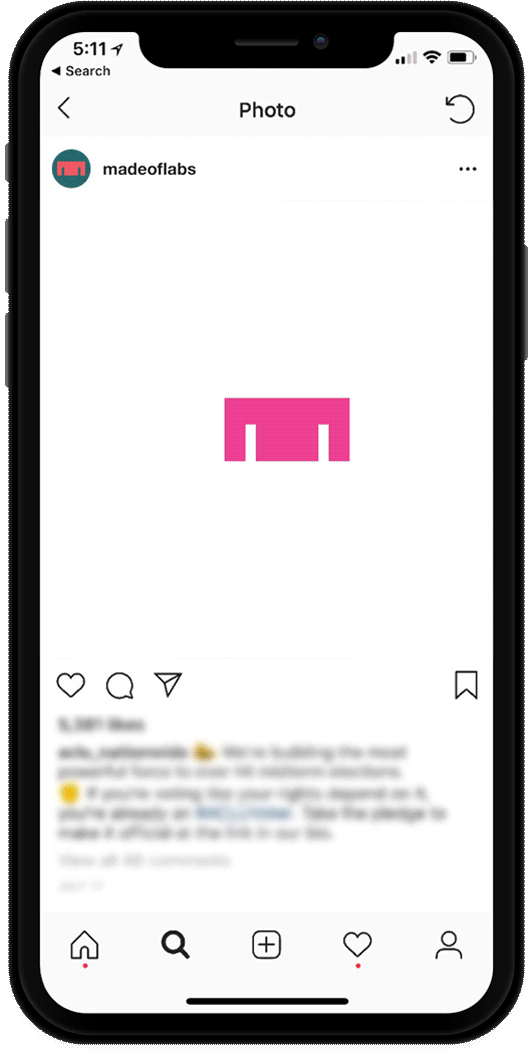
The Logotype:
We have designed a customized logotype incorporated with the avatar (M) to ensure it always feels present, reflecting the name even when it is small. We utilized a serif font, Merriweather, as the agency body text and customized it by taking some of the proportion of The Mix typeface.
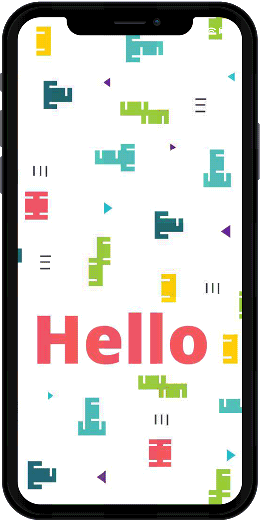
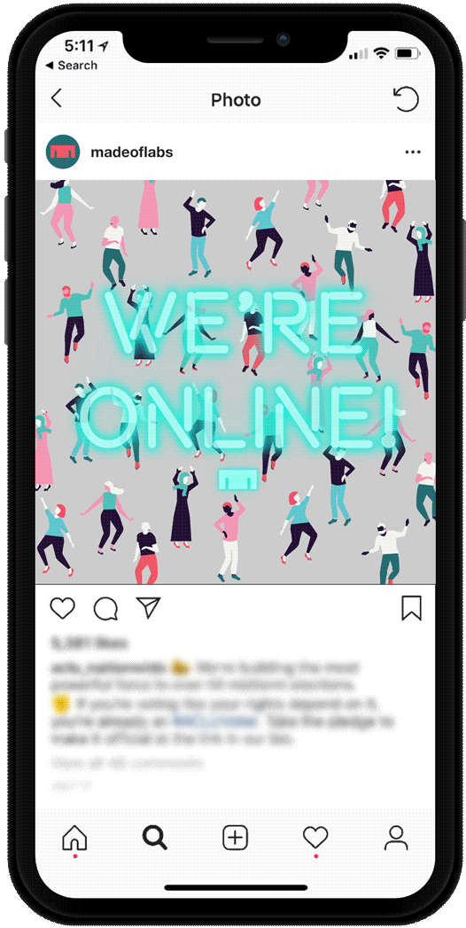
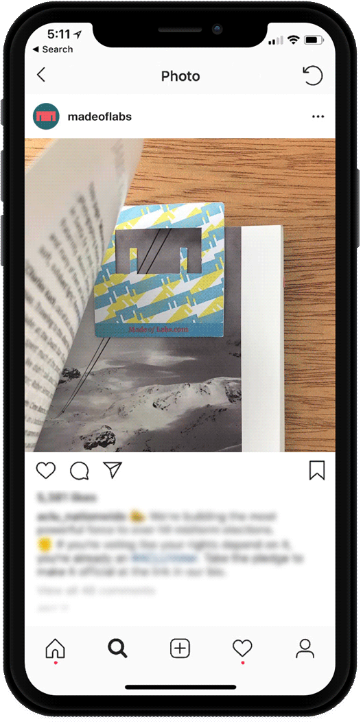
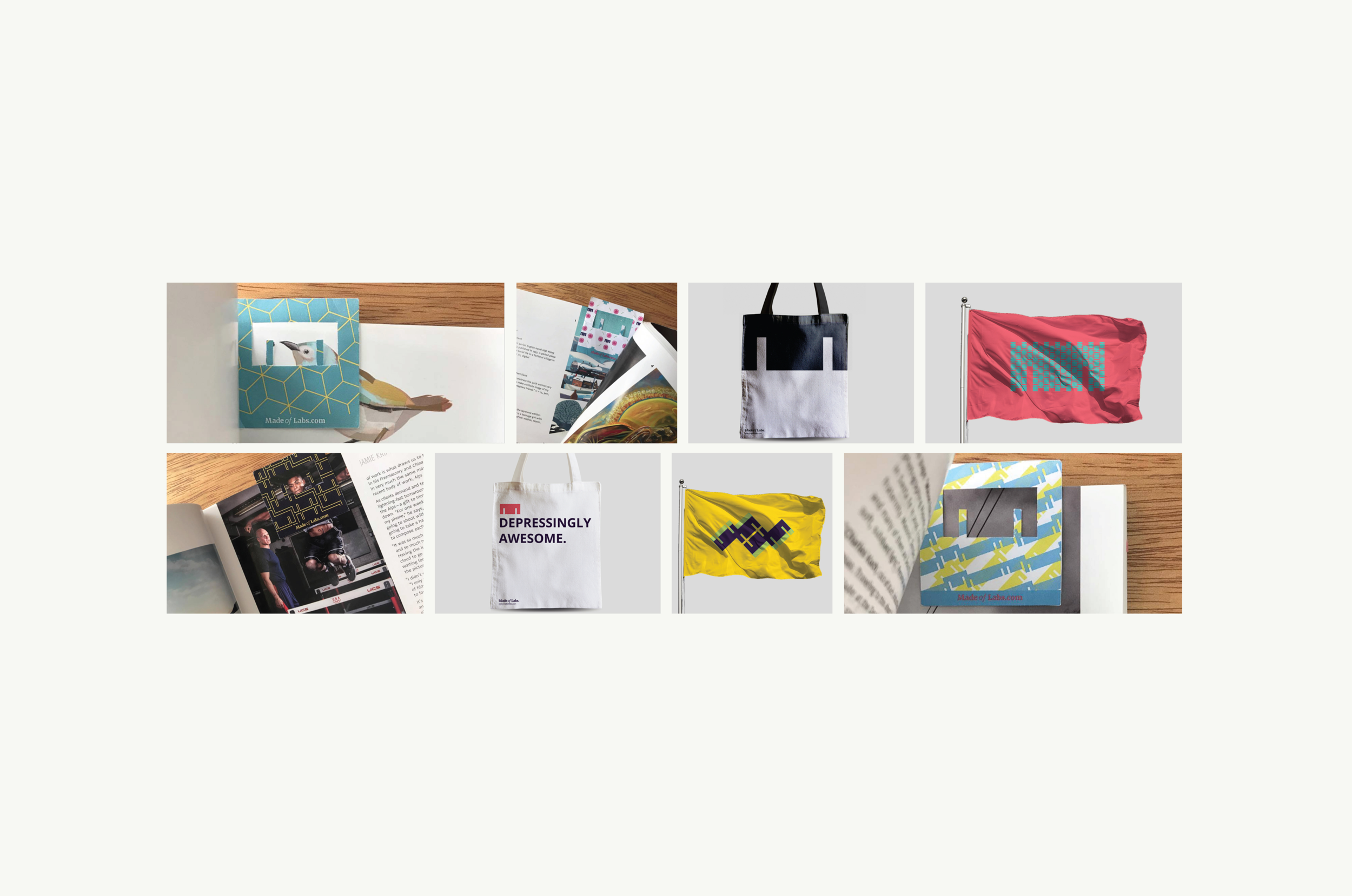
The Avatar:
The M is Made of Labs flag. It is the one element in the visual identity that will be altered and changed. The shape and space of the letter serve as a blank canvas for Made of Labs. This symbol serves as a tribute to the things that have been made and the things that Made of Labs love. We are excited to see where it can be taken.

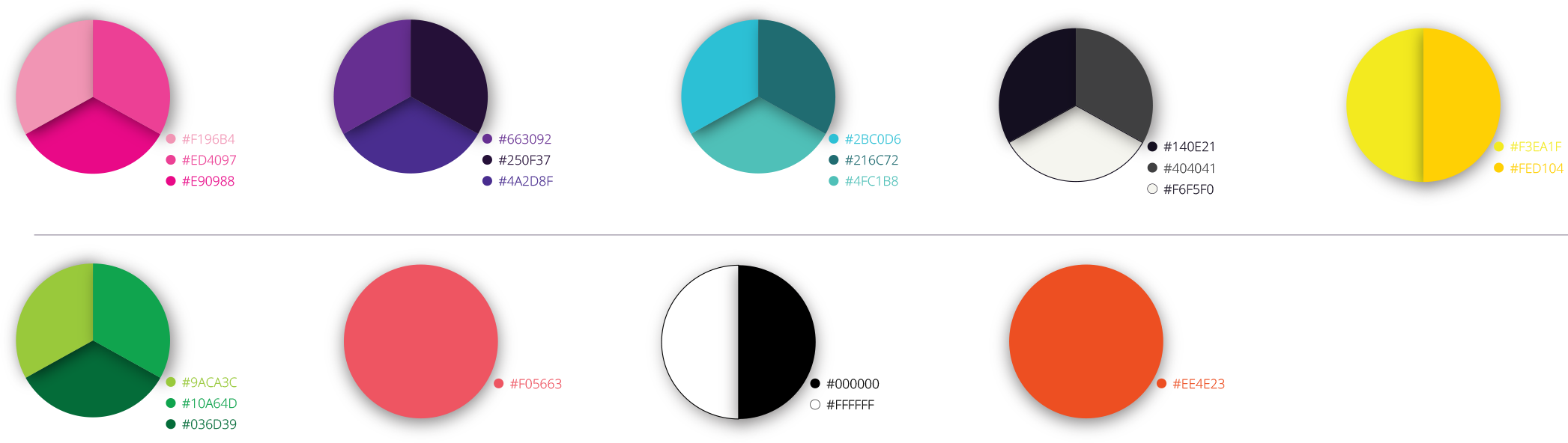
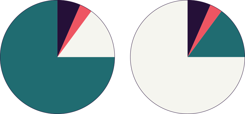
The Primary Color Palette:
We have developed a simple palette of modern complementary colors to create a strong contrast between all colors. This extended color palette has allowed the brand to reach more dynamism in its expression.
The Extended Color Palette: